something I am grateful for today
Apr. 23rd, 2022 01:28 pmgetting a bluetooth running for the first time ever — I feel like a Jetson!
something I am grateful for today
Apr. 21st, 2022 04:56 pmlearning a valuable lesson — today in particular, a valuable art lesson
Almost every book on drawing or painting stresses the value of values [lights and darks], and they are an aspect of art I have long taken for granted. But, now that I've started painting [and working in colour as opposed to the black and white of my comics work], the whole concept of value becomes more challenging for me. Learning to see the lightness or darkness of a colour is not always trivial for me. But all my recent lessons have been emphasizing the importance of this learning, so I finally reached the point where I am trying to pay more attention.
Almost every painting book recommends the exercise of painting a value scale, which looks something like this:
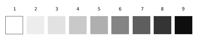
However, since my art skills are surpassed by my procrastination skills, I have never done so. I always handwaved and said yeah yeah I get it. Until today.
I approached the problem logically, and figured that a half-and-half mixture of black and white paint should give me a middle value like 5.
Not so.
It was with considerable consternation that I discovered a 50-50 mixture gave me a result barely distinguishable from 9. In fact, a 90% white - 10% black mixture gave me a result much like 7.
Up until now, when I painted, I mixed what I needed but never paid too much attention to how much of what I used. I just mixed til it worked. But today, by approaching this in a systematic fashion, I have learned a new appreciation for the darkening power of paints. That's gotta be worthwhile knowledge to have, right?
Almost every book on drawing or painting stresses the value of values [lights and darks], and they are an aspect of art I have long taken for granted. But, now that I've started painting [and working in colour as opposed to the black and white of my comics work], the whole concept of value becomes more challenging for me. Learning to see the lightness or darkness of a colour is not always trivial for me. But all my recent lessons have been emphasizing the importance of this learning, so I finally reached the point where I am trying to pay more attention.
Almost every painting book recommends the exercise of painting a value scale, which looks something like this:
However, since my art skills are surpassed by my procrastination skills, I have never done so. I always handwaved and said yeah yeah I get it. Until today.
I approached the problem logically, and figured that a half-and-half mixture of black and white paint should give me a middle value like 5.
Not so.
It was with considerable consternation that I discovered a 50-50 mixture gave me a result barely distinguishable from 9. In fact, a 90% white - 10% black mixture gave me a result much like 7.
Up until now, when I painted, I mixed what I needed but never paid too much attention to how much of what I used. I just mixed til it worked. But today, by approaching this in a systematic fashion, I have learned a new appreciation for the darkening power of paints. That's gotta be worthwhile knowledge to have, right?
something I am grateful for today
Apr. 14th, 2022 07:18 pma perfect nap
I was sitting on the couch after getting a few things taken care of, and accidentally nodded off... not for long, maybe half an hour. But I woke up feeling like it was exactly what I needed then, and like this is how I always want to feel after a rest. It was so restorative that I was a bit stunned.
I was sitting on the couch after getting a few things taken care of, and accidentally nodded off... not for long, maybe half an hour. But I woke up feeling like it was exactly what I needed then, and like this is how I always want to feel after a rest. It was so restorative that I was a bit stunned.
something I am grateful for today
Apr. 11th, 2022 07:58 amjust saw Statuedog® going by for a walk — after a few years of seeing him almost every day, I got spoiled and looked forward to him, but this is the first time I've seen him since December. I'm not used to going so long without a Statuedog sighting, I was seriously worried that something had happened to him...
something I am grateful for today
Apr. 9th, 2022 10:00 ama new album from The Linda Lindas
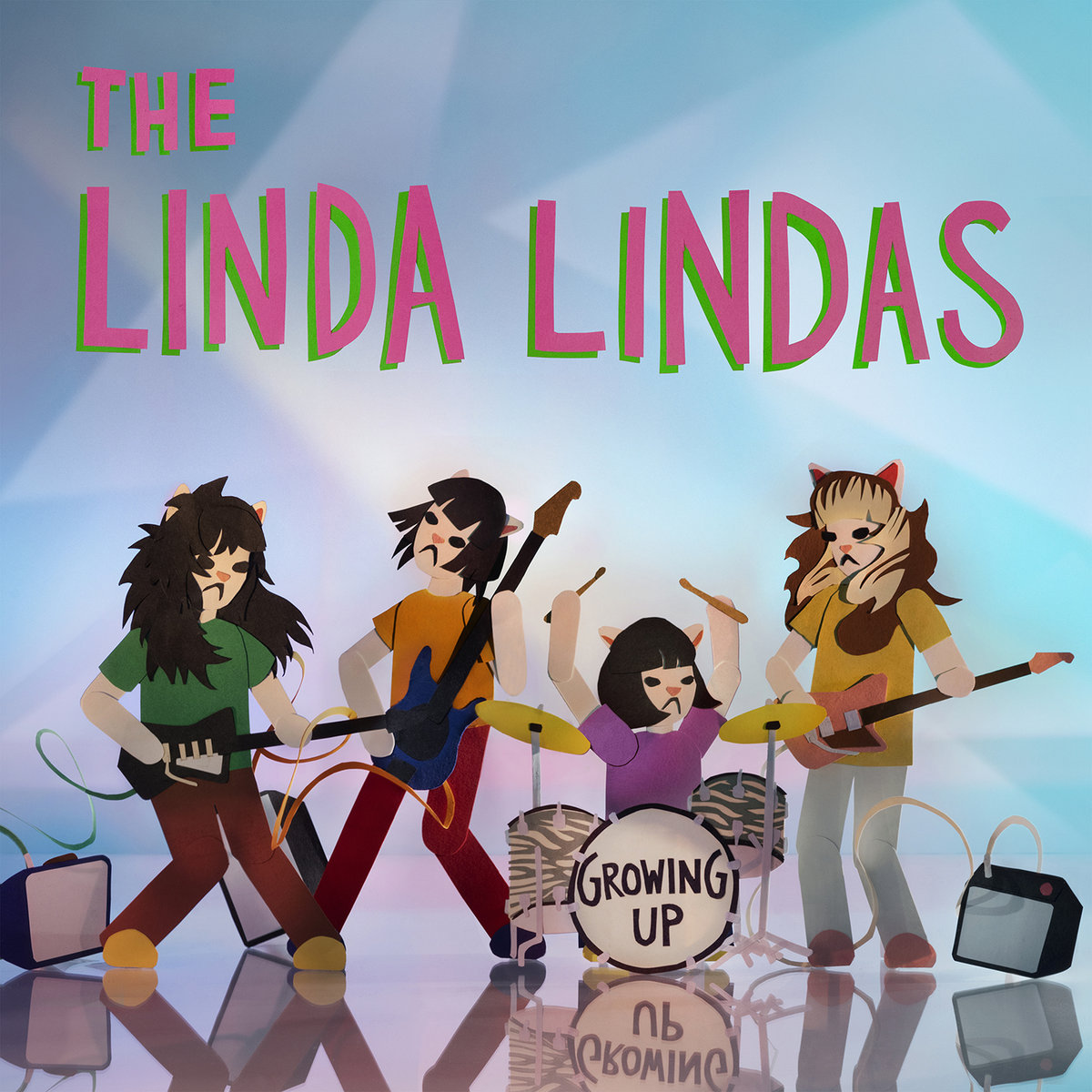
Gotta tell ya, I find a lot of these songs uncommonly well-crafted for punk rock, and for such young creators....
Gotta tell ya, I find a lot of these songs uncommonly well-crafted for punk rock, and for such young creators....
painting geek musings
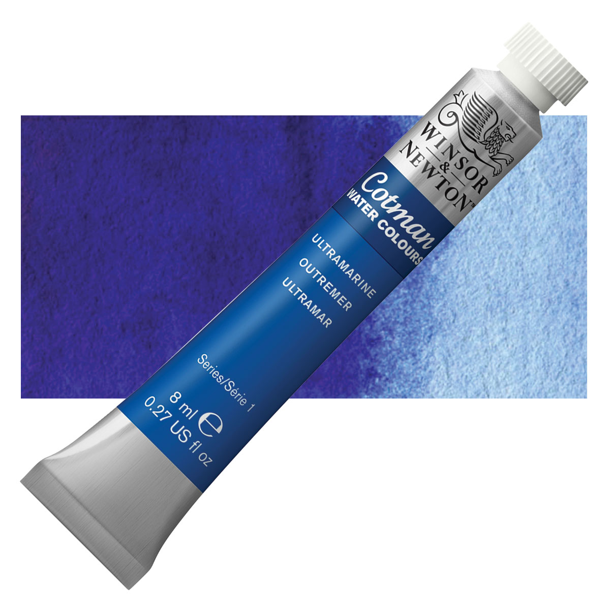
Apr. 5th, 2022 04:32 pmWhether I'm painting in watercolour, acrylic, or gouache, I seem to go through ultramarine faster than any other colour.
With acrylic, burnt umber and white are also way up there — and in fact I have done paintings using only those three, and hope to try more of that.
Same top colours with gouache, but there, white is far and away what I use most of.
Meanwhile, with all of them, I have tubes of other colours I haven't even opened yet. Go figure.
My fifth gouache is a tribute to musical and visual artist Gizelle Smith. The hair was particularly challenging — I don't think I nailed it spectacularly, but I also don't know that I am capable of doing it much better than this now, either.

all you need is hate
Apr. 3rd, 2022 08:39 pmA while back, I posted about how I had stopped enjoying doing the dishes. Since that post, things got worse for a while — I would sometimes blow them off completely and let them pile before I could make myself do them.
Recently, though, I have done a mysterious about-face. I am now doing them several times a day. Not only that, but I don't even leave them in the drying rack like I always used to — now I hand-dry them and put them away immediately.
The weird part is realizing why I am doing this.
Previously, I had simply got to the point where I hated doing the dishes. But now, a mysterious change of heart has me hating to see the dishes laying around. I'd rather get 'em done and out of my sight.
There's more:
After Christmas, I went through a stretch when I wasn't doing any art. Because I resented feeling obligated to do it. I was always reading about how you should paint every day or draw every day or write every day. If you're Serious about it. And I was like, “Well, maybe I'm not!” I just hated having it feel like a duty or a chore.
But recently I have started painting and drawing pretty much every day. Because I suddenly began hating how it feels like I have wasted a day by not creating anything.
My point — the weirdness of it all — is realizing to what extent my choices and decisions and actions are being guided by hate. I dunno where this is coming from.
Fisherman on the Laita
Mar. 31st, 2022 03:04 pmMy fourth gouache is a study of the 1890 painting Fisherman on the Laita by Paul Sérusier. I was immediately taken by this work the first time I saw it — something about his unusual colour choices and his simplification into graphic shapes. I decided to work from a smaller-than-necessary reproduction of the work, so that fine details would drop out and the shapes would grow flatter and simpler — emphasizing the aspects that attracted me. It felt like a good learning experience for me.

underdog albums
Mar. 27th, 2022 05:55 pmI am a fan of numerous movements and eras in rock music, but I recently noticed an oddity about my fandom:
Each movement has its major figures, innovators and leaders, and landmark albums. But, very often, my personal fave album in the movement is a more obscure one by a lesser light. Just something about that particular collection of consistently good songs and performances that speaks to me more — it happens more often than I'd expect.
British Invasion
Major figures would include The Beatles, The Rolling Stones, The Kinks, and The Who. But my fave British Invasion album is Shake Some Action by Flamin' Groovies.
punk
Major figures would include The Ramones, The Sex Pistols, and The Clash. But my fave punk album is (I'm) Stranded by The Saints.
Madchester
Major figures would include The Stone Roses, Happy Mondays, Inspiral Carpets, and The Charlatans. But my fave Madchester album is the self-titled debut by Ocean Colour Scene.
shoegaze
Major figures would include My Bloody Valentine, Ride, and Slowdive. But my fave shoegaze album is Against Perfection by Adorable.
Britpop
Major figures would include Suede, Blur, Oasis, and Pulp. But my fave Britpop album is the self-titled debut by Rialto.
Go figure, eh?
My third gouache is another singer tribute — this time, to Alanna Quinn-Broadus, vocalist for the band Alanna Royale. I decided on a different approach for this one, because the lighting on my reference pic was very bright. This washed out much of the photo. so that there was very little in the way of forms being modelled by colour and shade. Instead, it was largely flat shapes defined by contour, with a few linear details. But I particularly liked the contours in that pic, which is why I chose it as my reference anyway. So I kept the painting small, forcing me to streamline those details, and emphasized the flat graphic-arts nature of gouache: converting the background to a flat black shape and stylizing the hair, in a manner which I admit makes it rather similar to my cartooning work.
Once again, I didn't manage to nail a photographic likeness, but I think as a graphic work in and of itself, it holds up not too bad.

UPDATE: I also posted this to my Instagram... and received a comment on it from Alanna herself:
Once again, I didn't manage to nail a photographic likeness, but I think as a graphic work in and of itself, it holds up not too bad.
UPDATE: I also posted this to my Instagram... and received a comment on it from Alanna herself:
OH. MY. GOD. i am BEYOND impressed and honored you would pick up a brush with my face in mind. i truly love this. may i share?How swell is that?
something I am grateful for today
Mar. 26th, 2022 07:13 pmI drop in to Puffle Café several times a week and always order two large black americanos for me and the missus. The proprietor is a chipper outgoing guy who loves to gab, which makes it easier for me. He asked me if I had plans for the weekend and I told him I was hoping to paint.
"Canvas or house?"
"Canvas."
And his eyes got big. "You paint?! I never knew!" And before I could even reply, he said, "I've been wanting to get some art up in here. Bring your paintings and I'll put them up. We can try and sell them." And he was convinced that displaying my art, sight unseen, was a good idea. [I think he just really believes in promoting local talent, especially if they are his regulars.]
And so today I got some frames for the pieces that need them, and I am gonna have my paintings displayed. Just like that. Wild or what?
robin redux
Mar. 24th, 2022 05:03 pmOkay, let's call this Watercolour #25A. Today I decided to take another crack at yesterday's robin, but this time going for something a bit more expressionist and abstracted, aiming at a more minimalist, Chinese-calligraphy approach to it. Trying to put a form down in as few brushstrokes as I could manage. I used the same brushes and paints, but actual watercolour paper this time [you might be able to make out a bit of the paper texture in the photo].
Once again, not amazing but not abysmal. Gotta say, though, the whole process of putting the brush down more mindfully each time, trying to get it down right in one stroke [not always succeeding, but trying] — I found all that very instructive. That alone made the exercise worth my while.

Once again, not amazing but not abysmal. Gotta say, though, the whole process of putting the brush down more mindfully each time, trying to get it down right in one stroke [not always succeeding, but trying] — I found all that very instructive. That alone made the exercise worth my while.
My 25th watercolour is a subject I've been meaning to do for a while now. It was made using the brushes and paints I won as a prize yesterday. Since there was very little paint provided to work with, I decided to work small [4 by 6]. Since I was working small and knew that my subject would include some fine details, I worked on smooth paper [bristol] instead of my regular cold-pressed watercolour paper. I've read that smooth [hot-pressed] paper co-operates better with small details, so here was my chance to try it out.
Turns out, I don't like the way watercolours handle on bristol all that much, and probably won't be going back to that. However, the paints were fine to work with -- a little went a long way. Which means they contain lots of pigment, which is what you expect in top-line paint like Daniel Smith. I wish I could afford to work with that caliber of paint regularly. And the brushes were wonderful, holding their point phenomenally well.
Bottom line: I don't think this painting turned out wonderful, but it's not terrible, either. It reminds me that I'm still learning.
something I am grateful for today
Mar. 21st, 2022 05:23 pmI got my new debit card today, and the number on it is identical to my current card. I was worried they would change the number on me [which has happened in the past!] and then I'd have to fuss with my laptop auto-filling the old number when I do online banking. I mean, I could manage that changeover but it's a pain, and I'm glad to be spared it.
Boat at Lake Trasimeno
Mar. 21st, 2022 04:42 pmMy second gouache is a study of an acrylic by Patti Mollica, Boat at Lake Trasimeno. When I first saw it, I was immediately drawn to how they abstracted the water into these big, bold, sweeping brushstrokes, and I was moved to try that out for myself.
